YEAR
2024
Quintal dos Zezecos
Quintal dos Zezecos is a restaurant brand built around homemade food, tradition, and a strong sense of comfort and familiarity.
Branding
Visual Identity
Services
Branding & Visual Identity
Category
Food & Beverage / Branding
Client
Zezecos (Father & Son)

Project Overview
Quintal dos Zezecos is a restaurant and snack bar known for its homemade food, artisanal sandwiches, and strong connection to its local community.
The project focused on developing a warm and inviting brand identity that reflects the care, tradition, and personality behind the business, translating its homemade essence into a visually engaging and memorable experience.
Creative Direction
DESIGN
• Warm Identity: Using color and composition to evoke comfort, familiarity, and appetite.
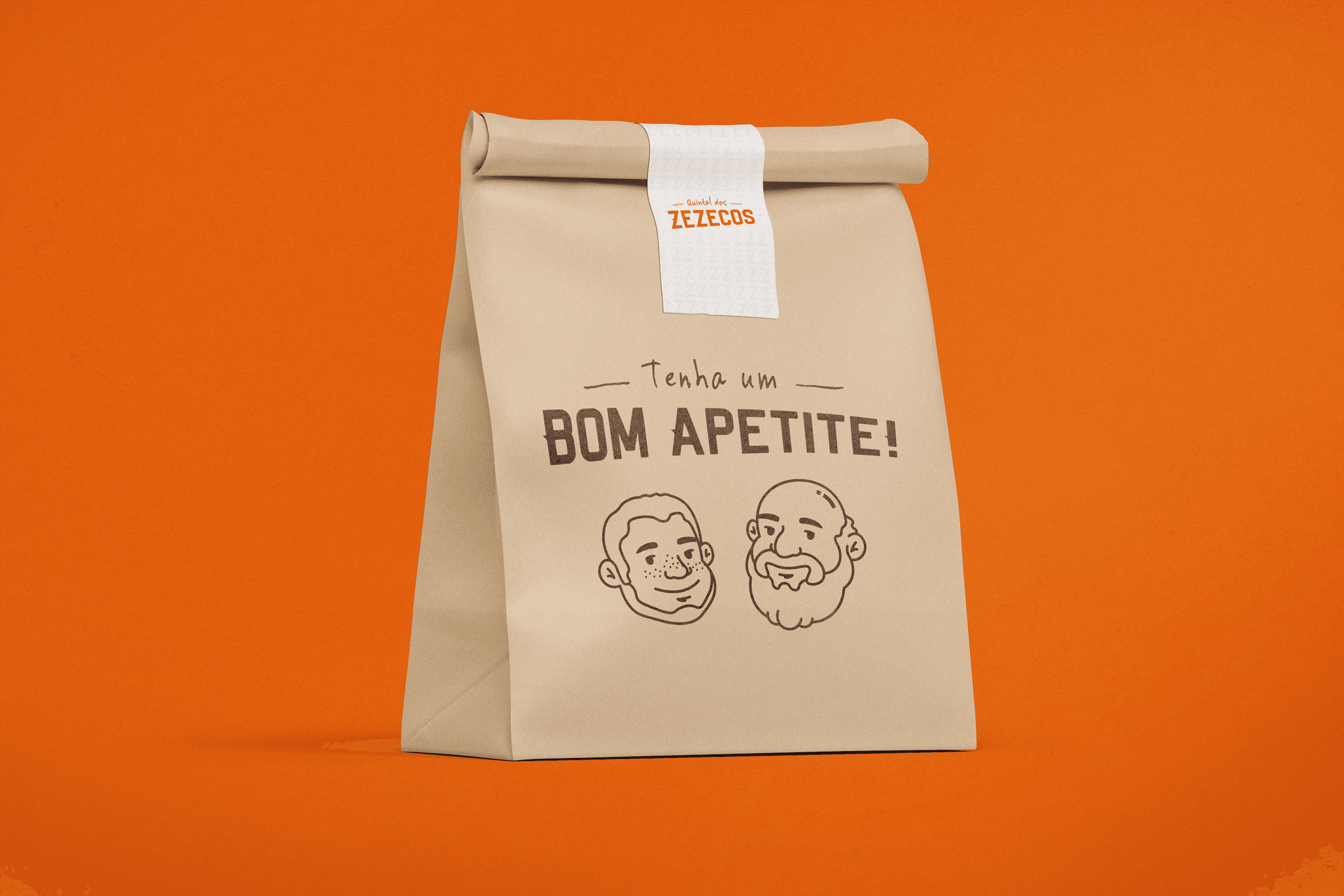
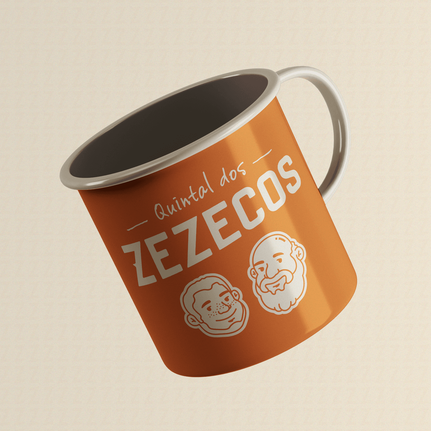
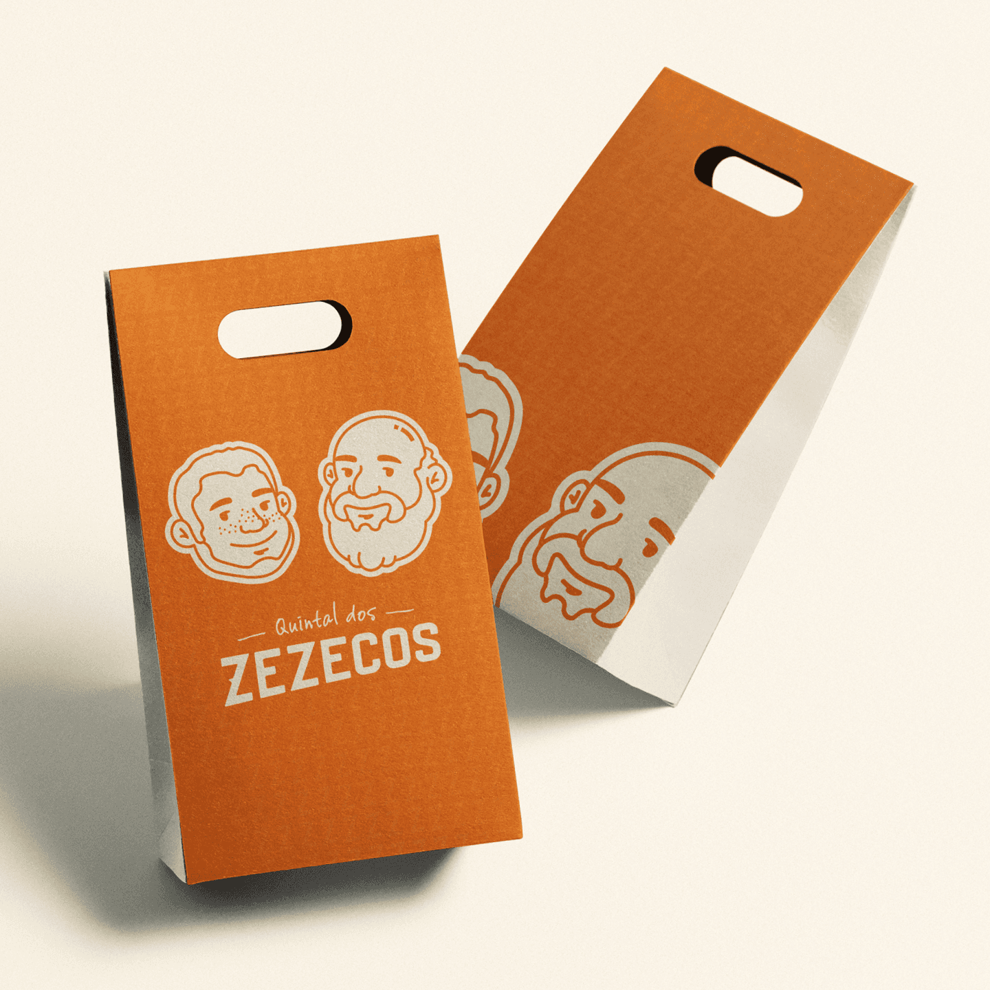
• Character-Driven Branding: Transforming the founders into visual symbols to strengthen recognition and emotional connection.
• Local Personality: Emphasizing authenticity through expressive and relatable visual elements.
• Subtle Patterns: Incorporating graphic details inspired by the logo to create consistency across applications.
Execution Approach
The visual system was built around a warm and cohesive color palette, with orange as the primary tone supported by neutral shades such as beige, white, and black.
The logo and character illustrations became central elements of the identity, allowing the brand to feel more personal and recognizable. These elements were applied across different materials (from packaging to visual compositions) ensuring consistency while maintaining a sense of charm and approachability.
The overall design focused on balancing simplicity with personality, creating a system that feels both structured and full of character.
From Concept to Execution
The concept was driven by the idea of translating the feeling of “home” into a visual identity, something that feels welcoming, familiar, and genuine from the first interaction.
The direction focused on reinforcing the emotional connection between the brand and its audience, highlighting the human aspect behind the business.
Creative Challenges
PROCESS
One of the main challenges was capturing the personality of the brand without making it feel overly informal or visually unrefined.
It required finding the right balance between playful and structured elements, ensuring that the identity remained both approachable and visually consistent.
Additionally, transforming real people into graphic symbols demanded careful stylization, preserving their identity while adapting them into a cohesive visual system.

The Final Result
The final result delivers a distinctive and welcoming brand identity that reflects the essence of the business.
Through a combination of warm tones, expressive characters, and thoughtful composition, the project creates a strong and memorable presence.
Visual Outcome
CONCLUSION
The outcome is a cohesive and engaging visual system that strengthens the brand’s connection with its audience.
By translating personality, tradition, and care into a clear visual language, the identity enhances recognition and reinforces the feeling of comfort associated with the brand.

More Other cases


FAQ