YEAR
2025
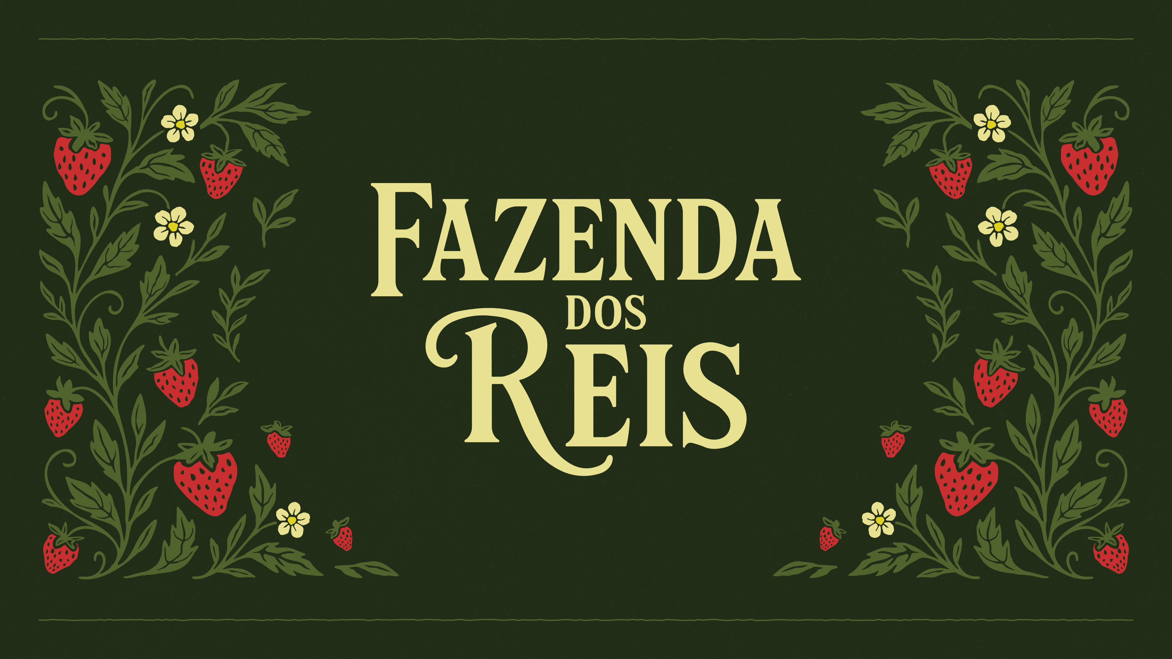
Fazenda dos Reis
Fazenda dos Reis is an artisanal brand that celebrates tradition, flavor, and small-batch craftsmanship.
Packaging
Visual Identity
Services
Packaging Design & Visual Identity
Category
Packaging / Label
Client
Rodrigo Monney

Project Overview
Fazenda dos Reis is an artisanal jam brand focused on quality, care, and small-batch production.
The project involved designing the packaging for their strawberry jam, with the goal of creating a visual identity that feels premium, nostalgic, and emotionally engaging, reflecting the handmade nature of the product.
Creative Direction
DESIGN
• Vintage Aesthetic: Drawing inspiration from the 60s and 70s to evoke nostalgia and authenticity.
• Artisanal Feel: Reinforcing the idea of small-batch production through delicate details and handcrafted visuals.
• Natural Elements: Incorporating strawberries, branches, and subtle floral accents to enhance the organic appeal.
• Elegant Composition: Balancing decorative elements with a clean structure to maintain a premium look.
Execution Approach
The design process focused on building a cohesive and timeless visual language that could instantly communicate tradition and care.
Typography played a central role, especially in the product title, which was designed to feel expressive and characteristic of vintage packaging. Textures and subtle imperfections were introduced to simulate a more tactile and authentic feel, while the overall layout ensured clarity and balance.
Every element was carefully positioned to create a harmonious composition that enhances both the visual appeal and the perceived value of the product.


From Concept to Execution
The concept was built around capturing the essence of traditional, homemade products. Something that feels familiar, warm, and trustworthy.
The goal was to create a packaging experience that immediately connects with the consumer, evoking memories and reinforcing the idea of a carefully crafted product.
Creative Challenges
PROCESS
One of the main challenges was stepping outside a modern design approach and fully embracing a vintage aesthetic without making it feel outdated or generic.
It required careful attention to typography, textures, and decorative elements to achieve authenticity while maintaining visual refinement.
Additionally, designing for a physical product introduced new considerations, such as label composition, readability, and how the design would translate in real-world applications.

The Final Result
The final result delivers a charming and distinctive packaging design that reflects the brand’s values of quality, care, and tradition.
Through a combination of vintage references, natural elements, and thoughtful composition, the product stands out while maintaining a sense of authenticity and warmth.
Visual Outcome
CONCLUSION
The outcome is a visually rich and memorable packaging experience that elevates the perceived value of the product.
By translating the idea of “small-batch production” into a cohesive visual language, the design creates a stronger emotional connection with the consumer and reinforces the brand’s identity.
More Other cases


FAQ