YEAR
2024
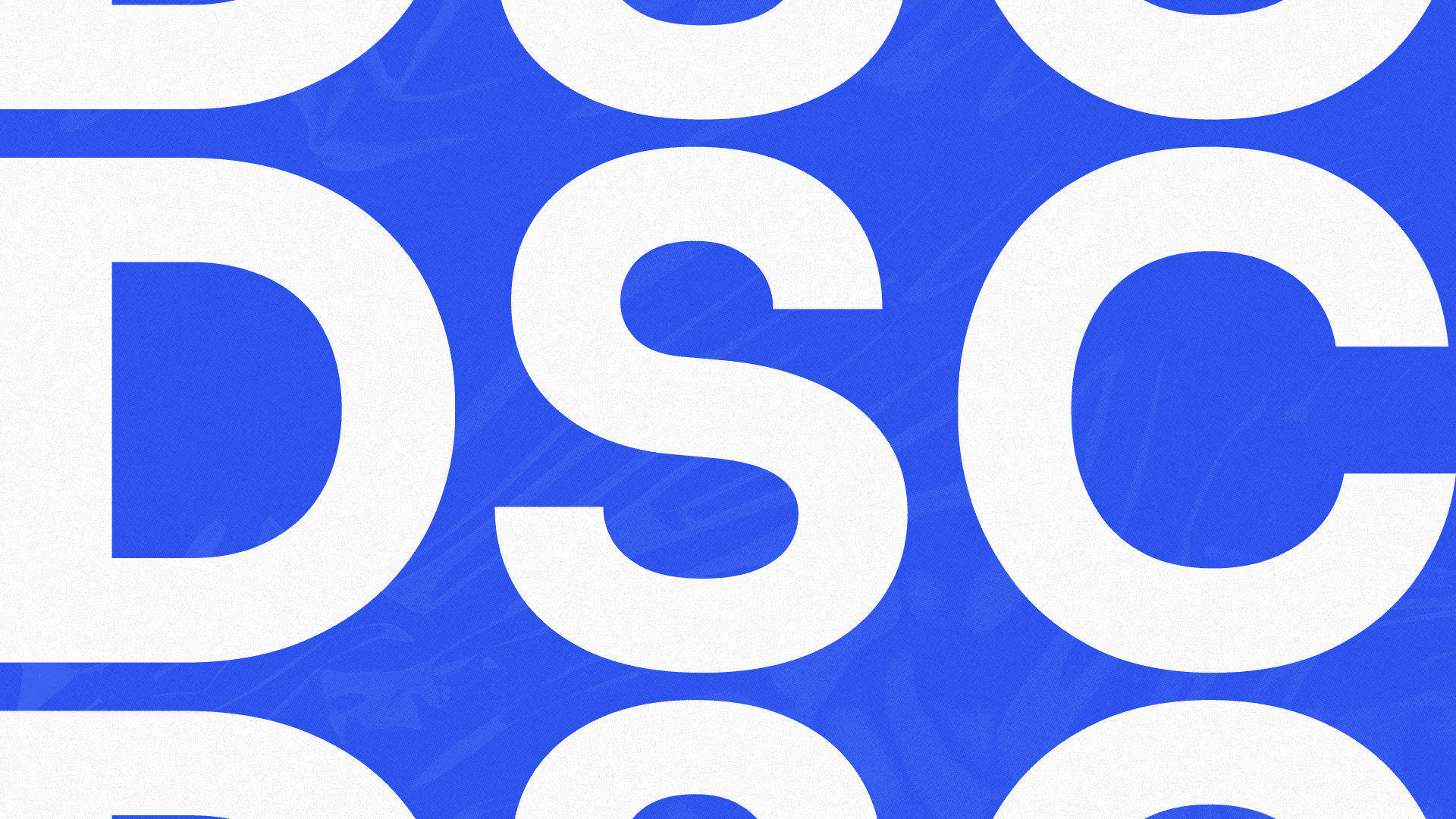
Double Sales Club
Double Sales Club is a community helping small businesses grow through creative and practical strategies.
Branding
Visual System
Services
Branding & Visual System
Category
Brand Identity
Client
Jonny Quirk


Project Overview
Double Sales Club (DSC) is a community-driven brand focused on helping small and medium-sized businesses grow through creative, accessible, and practical strategies.
The project involved building a bold and engaging visual identity that reflects the brand’s energetic and non-corporate approach, making business growth feel more human, approachable, and visually exciting.
Creative Direction
DESIGN
• Promotional Aesthetic: Drawing inspiration from discount labels, coupons, and retail visuals to create a familiar and engaging identity.
• Bold Minimalism: Using a reduced color palette with strong contrast to maximize visual impact.
• Textured Layers: Applying halftones and collage-inspired textures to bring depth and personality.
• Expressive Elements: Designing stickers, seals, and banners to reinforce messaging and create a dynamic visual system.
Execution Approach
The visual system was built to feel modular, flexible, and instantly recognizable across different formats.
A vibrant blue was used as the core color, supported by black and white to create strong contrast and hierarchy. Typography and messaging played a central role, with layouts designed to highlight key phrases and calls to action.
Graphic elements such as stickers, promotional ribbons, and layered textures were consistently applied to create a cohesive and energetic visual language.


From Concept to Execution
The concept was driven by the idea of making business content feel less rigid and more engaging, turning insights and strategies into something visually appealing and easy to consume.
The direction focused on creating a system that feels both familiar and fresh, drawing from everyday retail experiences while adapting them into a digital-first context.
Creative Challenges
PROCESS
One of the main challenges was balancing a highly expressive and layered visual style with clarity and readability.
It required careful control over composition, contrast, and hierarchy to ensure that each piece remained visually impactful without becoming overwhelming.
Additionally, building a cohesive system from a wide variety of elements (including stickers, textures, and promotional visuals) demanded consistency to maintain a strong and recognizable identity.

The Final Result
The final result is a bold and distinctive brand identity that captures attention while maintaining clarity and purpose.
By combining promotional aesthetics with modern design principles, the project creates a unique visual language that stands out within its space.
Visual Outcome
CONCLUSION
The outcome is a highly versatile and engaging visual system that supports content creation across multiple formats and platforms.
By transforming business communication into something dynamic and visually appealing, the project reinforces the brand’s mission of making growth more accessible, human, and impactful.
More Other cases


FAQ